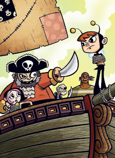
Alright, so this is my first Friday since determining that I would post a new, finished piece of work every week with the intent of building my portfolio and keeping this illustration business heading in a forward motion. Did I get the piece done? Sure did, and I'm really pretty happy with it. Check it out:
Using my "kid in a bee costume" character again (cooler name forthcoming), I decided I would turn him into something of a young superhero-type starring in his own series of middle-grade graphic or possibly prose novels. That's a market that I think the type of work I like to do fits well in. The above image would be the cover illustration to one of his harrowing adventures. I'm thinking about some black & white images for the interiors that would accompany the text, if the book were to go the prose route.
Process stuff... My process isn't really anything revolutionary but I always like to see this stuff from other artists so perhaps someone may enjoy this part.
1. Thumbnail - This rough image is about 2.75" x 3.5". I just drew it up quickly one day, thinking about situations to put our hero in. Didn't spend a lot of time on it, just tried to get a sense of the composition.
2. Pencils - I worked at my intended final print size of 6" x 8.25". I would usually work at least a little larger than the print size. These were only supposed to be slightly tighter roughs, which is why I worked smaller, but I kind of got into the drawing and finished them up. I scanned them in at 600 dpi so I could blow it up to the size I would have probably drawn it at when I converted it to a print friendly 300 dpi.
3. Inks - Technically there isn't any ink involved here since I do the line work in Adobe Illustrator. I place the pencils on their own layer and set it to dim the image 50%. Then I start an "inks" layer where I use a combination of the pen tool to trace some of my lines as paths and my Wacom tablet and some customized brushes for stuff like the woodgrain. I'm using it more for the other lines as well, but I'm still learning with it.
4. Flat Colors - After the line work is done I create a layer under the "inks" layer and label it "colors". I do all of the flat color this way, using the pen tool creating shapes. It's probably time consuming to do it this way, but I've been doing this since art school where I was more comfortable with Illustrator and vector art than with PhotoShop. It's weird but I just like to do it this way. Anyhow, you'll see that the color isn't totally flat as I did put some shadows on the figures. Part of the aesthetic that I'm going for is a cell shaded Saturday morning cartoon kind of feel where the somewhat flat characters pop off of a more painted looking background. Which brings us to PhotoShop.
5. Painting and Texture - After I've finished the flat color I export my Illustrator file as PhotoShop document, preserving all the layers. I then open the file up in PhotoShop and start adding textures and painting some shadows and highlights (mostly on the background elements). This piece doesn't have much of that , just some painting on the ship, some texture on the sail. I used a scanned paper texture that I placed over the flats and adjusted levels until I got it where I wanted. I also used the gradient tool in the sky to throw some color variations in there.
That was about it. I'm pleased with the results. If anyone reading this has any comments or critiques please let me know. Feel free to give an honest opinion, I can take it. I'm always looking for ways to improve things and sometimes there can be glaring problems that the artist can't see because they're too close to the piece. So fire away.
Next week I'll hopefully have another new piece. I say hopefully because I'm getting started on paying work, which obviously has to be the priority. I think I can fit something though, so look for that on Friday.
Thanks for stopping by.
Friday, October 30, 2009
Wednesday, October 28, 2009
Sailing Can Be Fun!
Friday, October 23, 2009
This Week in Perpetual Motion 06: Moving Right Along
So hey, internet, we're just gonna forget about September, ok? Between a new baby, two older kids, a full time job, finishing up Princess Candy book 3 and the inability of my brain to put together any coherent thoughts during that time, September and most of October were a bust as far as regular updates go. Not what I had hoped for this little experiment, so I'm going to try to get back into the swing of things now.
In the time between finishing the third Princess Candy installment and getting started on the next I've been trying to update my portfolio site, work on new pieces for said portfolio and build a contact list for an upcoming mailing. 2009 has been pretty busy so these have all been things I unfortunately neglected. I've also managed to do some writing for a web comic project that I'll probably be announcing early next year. Anyhow, I haven't just been sitting on the ol' duff.
You can see some of the fruits of my labor here at my portfolio site, updated with a smattering of newer images and a bunch of golden oldies.
Since I'm focusing my attention on the children's market one of the best resources that I'm using to build my mailing list is the 2010 Children's Book Writer's and Illustrator's Market book. If anybody out there is reading this and has any other suggestions please shoot me an email or comment below.
As for new pieces, I'm trying to finish some up before I start on the next Princess Candy book but honestly, I've been in a bit of a rut. I have plenty of sketches of pieces that I need to get moving on but I'm over thinking them, wondering if they're the right pieces to market myself with or if I need to change up my style a bit. Consequently, I end up paralyzing myself with these considerations and don't get much accomplished. At least that was the case, until yesterday when I was listening to Thomas James' fantastic podcast, Escape from Illustration Island and he was interviewing Jonathan Woodward who runs the blog Zero 2 Illo. Jonathan has been using Zero 2 Illo to document his transition from a freelance graphic designer to a freelance illustrator, putting it out there as a resource for other aspiring illustrators. During the course of the interview, which was great (as always, Escape from Illustration Island is a phenomenal show), Jonathan explained that he blogs about his work schedules and posts deadlines for himself because if he didn't, he might not get the work done. Hearing that, I decided that some self-imposed deadlines would be just the thing to get me to pull the trigger on these illustrations.
So here's the skinny... each week I'm going to work on a new piece, and post it here every Friday as my Perpetual Motion report, column thing. I'll use that to go over the process, post sketches and whatnot, chat about other stuff I've observed along the way. Hopefully, the issues of style and marketing that I've been mulling over will work themselves out through doing the work rather than through all my navel gazing. Even if each image isn't star search material, I should end up with some nice additions to the portfolio. Sound like a good plan?
That's it in a nutshell. If you're still reading then I salute you for your tenacity and fortitude. In the future, there will be fewer words and most certainly more pictures. For now, I leave you with this space kid.
Friday, October 09, 2009
Illustration Friday: Flying
When you're skating really fast, it give you the sensation of flying. Ok, it's a stretch, but maybe these kids just used flying to describe how speedy they were, like, "Man, I was totally flying across the pond! It was wicked!"
That's what I would have said when I was a kid. Actually, I'll say that this winter when I go skating.
Subscribe to:
Posts (Atom)