Alright, so this is my first Friday since determining that I would post a new, finished piece of work every week with the intent of building my portfolio and keeping this illustration business heading in a forward motion. Did I get the piece done? Sure did, and I'm really pretty happy with it. Check it out:
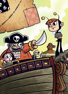
Using my "kid in a bee costume" character again (cooler name forthcoming), I decided I would turn him into something of a young superhero-type starring in his own series of middle-grade graphic or possibly prose novels. That's a market that I think the type of work I like to do fits well in. The above image would be the cover illustration to one of his harrowing adventures. I'm thinking about some black & white images for the interiors that would accompany the text, if the book were to go the prose route.
Process stuff... My process isn't really anything revolutionary but I always like to see this stuff from other artists so perhaps someone may enjoy this part.
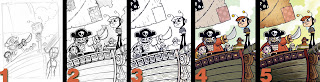
1. Thumbnail - This rough image is about 2.75" x 3.5". I just drew it up quickly one day, thinking about situations to put our hero in. Didn't spend a lot of time on it, just tried to get a sense of the composition.
2. Pencils - I worked at my intended final print size of 6" x 8.25". I would usually work at least a little larger than the print size. These were only supposed to be slightly tighter roughs, which is why I worked smaller, but I kind of got into the drawing and finished them up. I scanned them in at 600 dpi so I could blow it up to the size I would have probably drawn it at when I converted it to a print friendly 300 dpi.
3. Inks - Technically there isn't any ink involved here since I do the line work in Adobe Illustrator. I place the pencils on their own layer and set it to dim the image 50%. Then I start an "inks" layer where I use a combination of the pen tool to trace some of my lines as paths and my Wacom tablet and some customized brushes for stuff like the woodgrain. I'm using it more for the other lines as well, but I'm still learning with it.
4. Flat Colors - After the line work is done I create a layer under the "inks" layer and label it "colors". I do all of the flat color this way, using the pen tool creating shapes. It's probably time consuming to do it this way, but I've been doing this since art school where I was more comfortable with Illustrator and vector art than with PhotoShop. It's weird but I just like to do it this way. Anyhow, you'll see that the color isn't totally flat as I did put some shadows on the figures. Part of the aesthetic that I'm going for is a cell shaded Saturday morning cartoon kind of feel where the somewhat flat characters pop off of a more painted looking background. Which brings us to PhotoShop.
5. Painting and Texture - After I've finished the flat color I export my Illustrator file as PhotoShop document, preserving all the layers. I then open the file up in PhotoShop and start adding textures and painting some shadows and highlights (mostly on the background elements). This piece doesn't have much of that , just some painting on the ship, some texture on the sail. I used a scanned paper texture that I placed over the flats and adjusted levels until I got it where I wanted. I also used the gradient tool in the sky to throw some color variations in there.
That was about it. I'm pleased with the results. If anyone reading this has any comments or critiques please let me know. Feel free to give an honest opinion, I can take it. I'm always looking for ways to improve things and sometimes there can be glaring problems that the artist can't see because they're too close to the piece. So fire away.
Next week I'll hopefully have another new piece. I say hopefully because I'm getting started on paying work, which obviously has to be the priority. I think I can fit something though, so look for that on Friday.
Thanks for stopping by.


